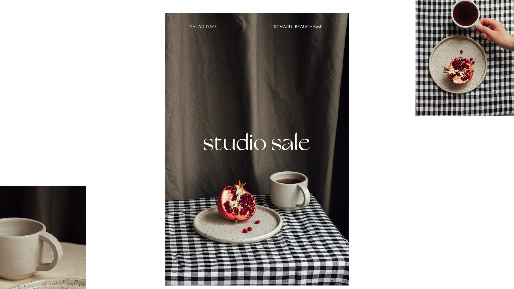
WORK MAJOR PROJECT
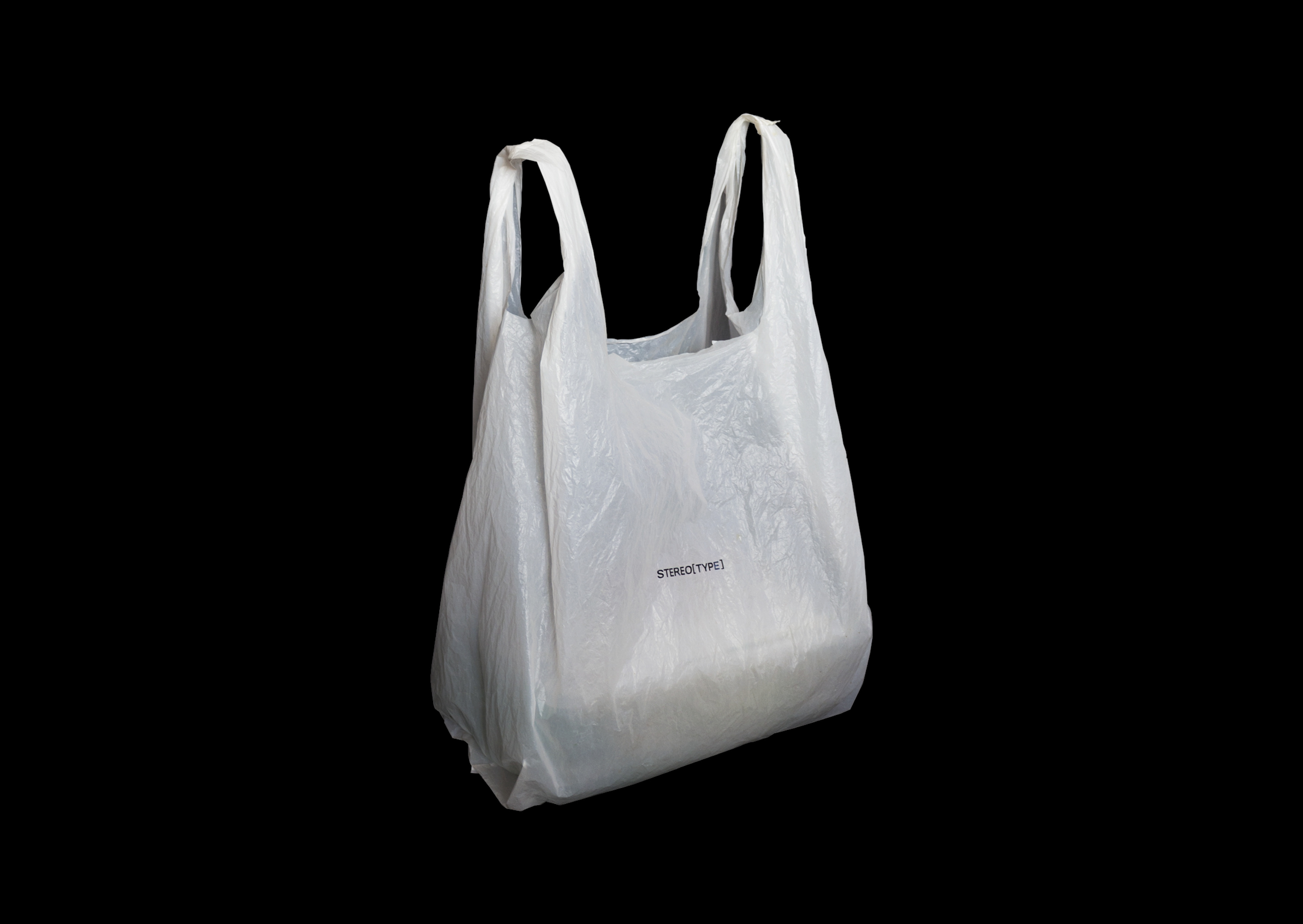
STEREO[TYPE] is an exploration of typography and culture.
Unpacking the responsibility visual communication holds.
Unpacking the responsibility visual communication holds.
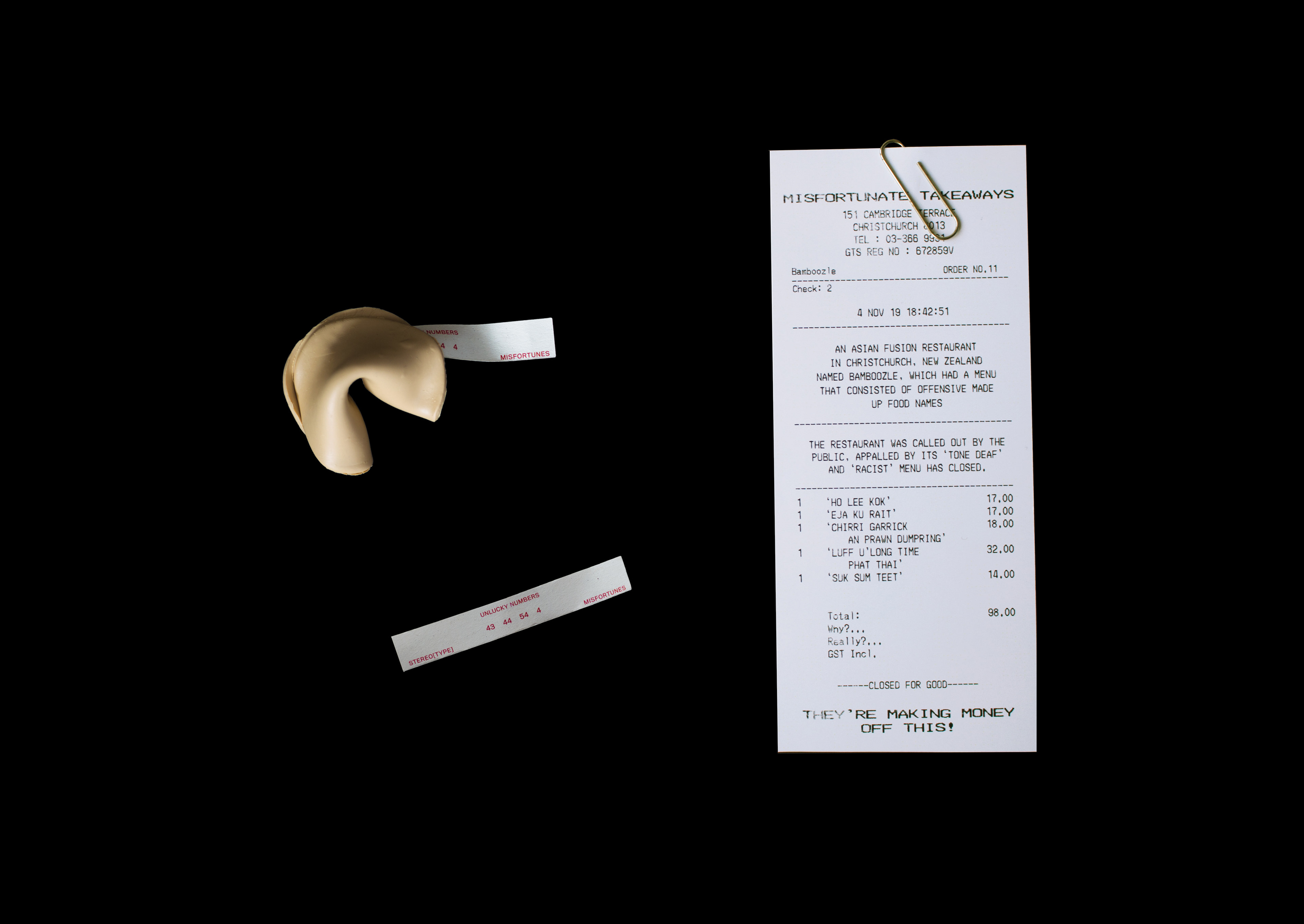
Communication design has the power to inform, educate, a person or audience. This gives us the power to perceive culture through visual forms, which can also lead to misrepresentations of culture through stereotypes and racist intentions.
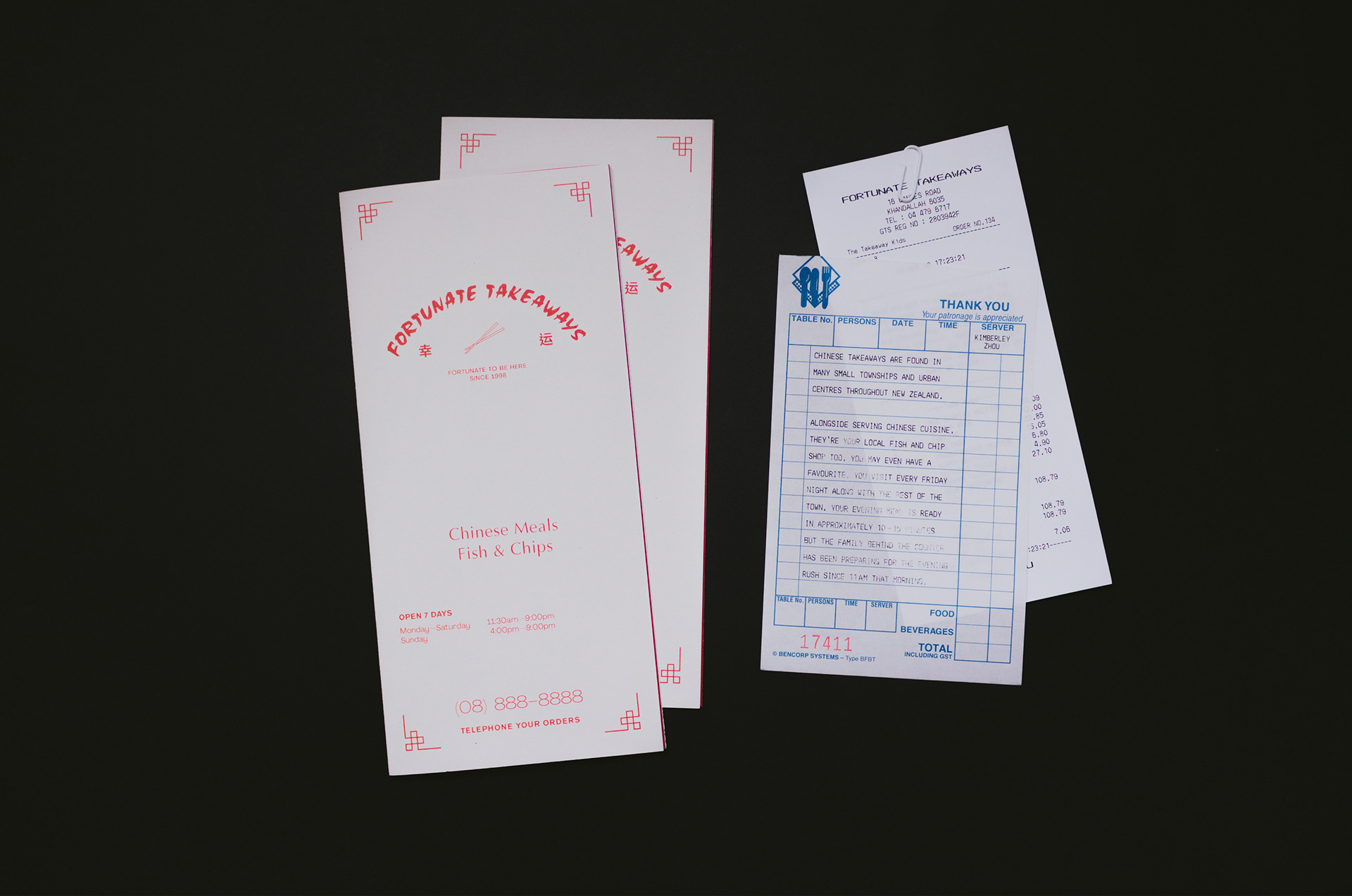
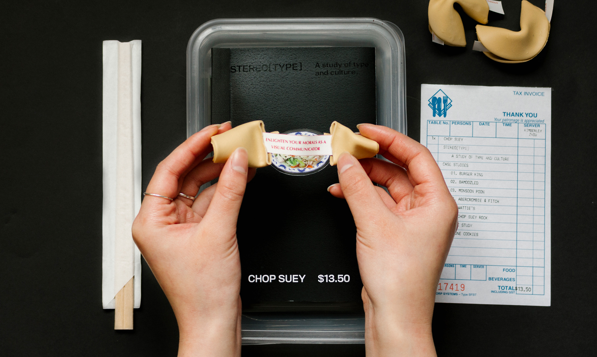
The objective of ‘Chop Suey’ is to enlighten the morals of designers about the responsibility of visual communication. ‘Chop Suey’ is an exploration of typography and culture. Unpacking the link between the dish and the lettering categorised as ‘ethnic’ known as chop suey lettering. Using this critical thinking, my project investigates key ideas surrounding its origin and use. Discussing the discourse around cross-cultural appropriation and those unexpected places where cultures meet.
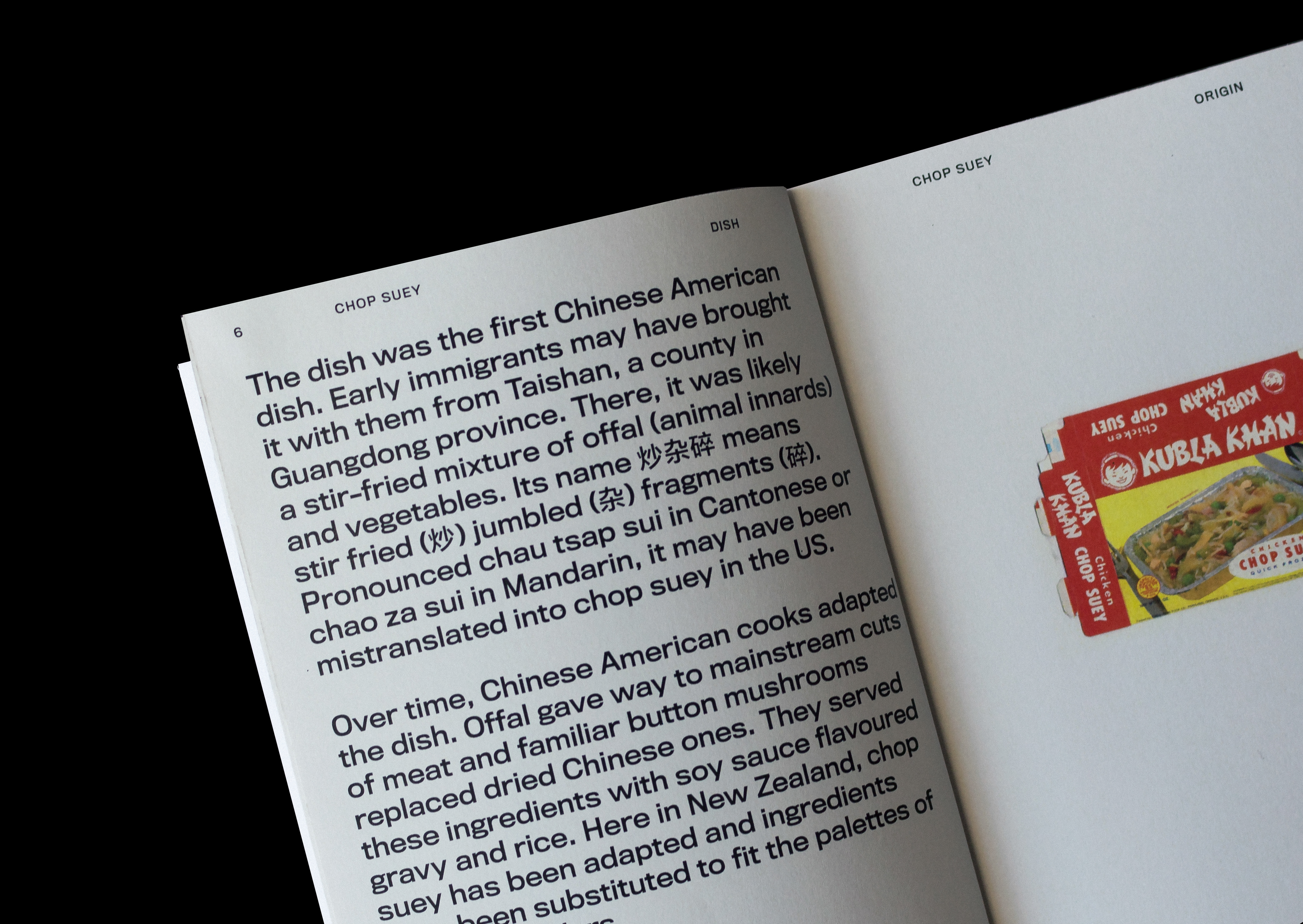
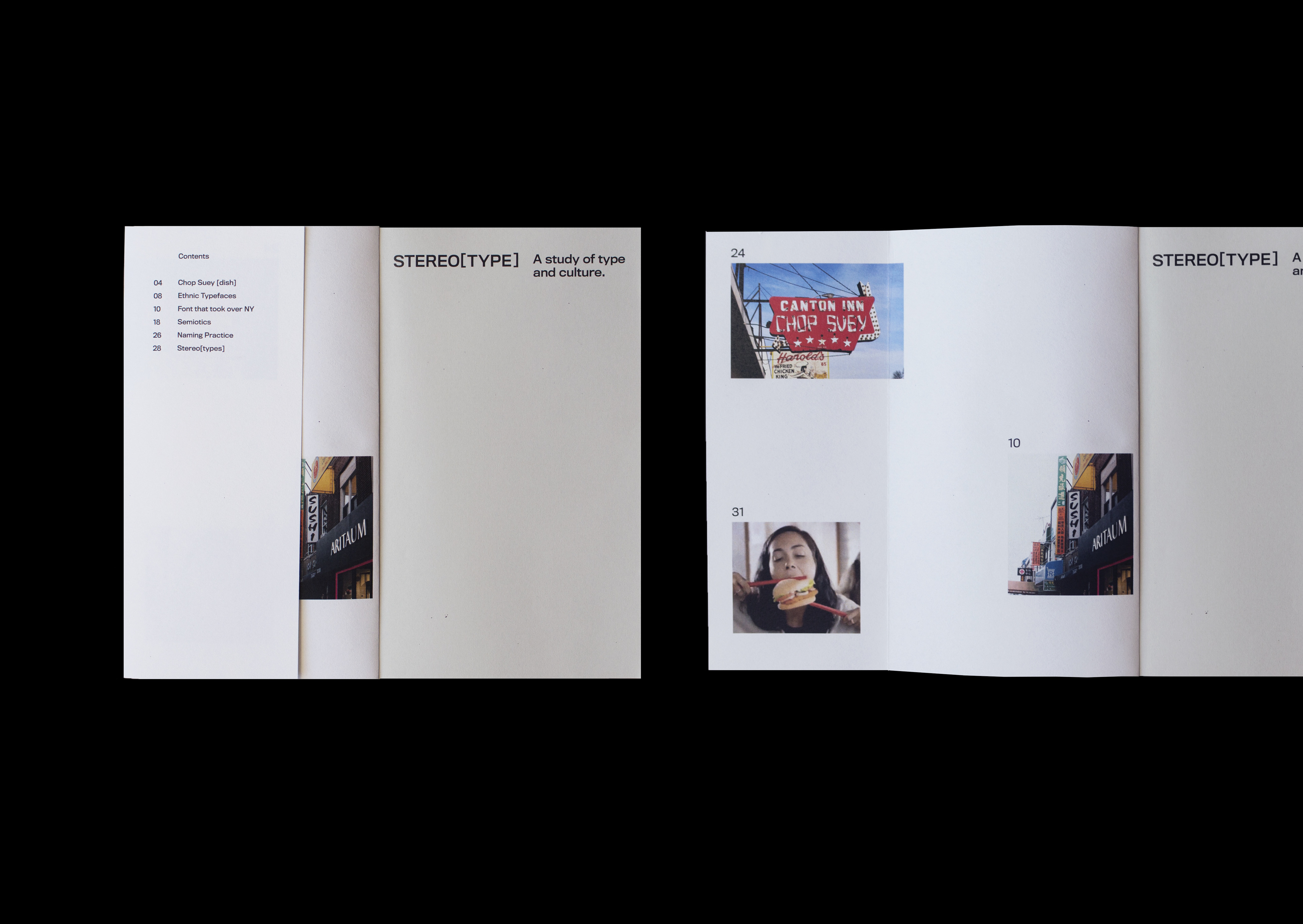
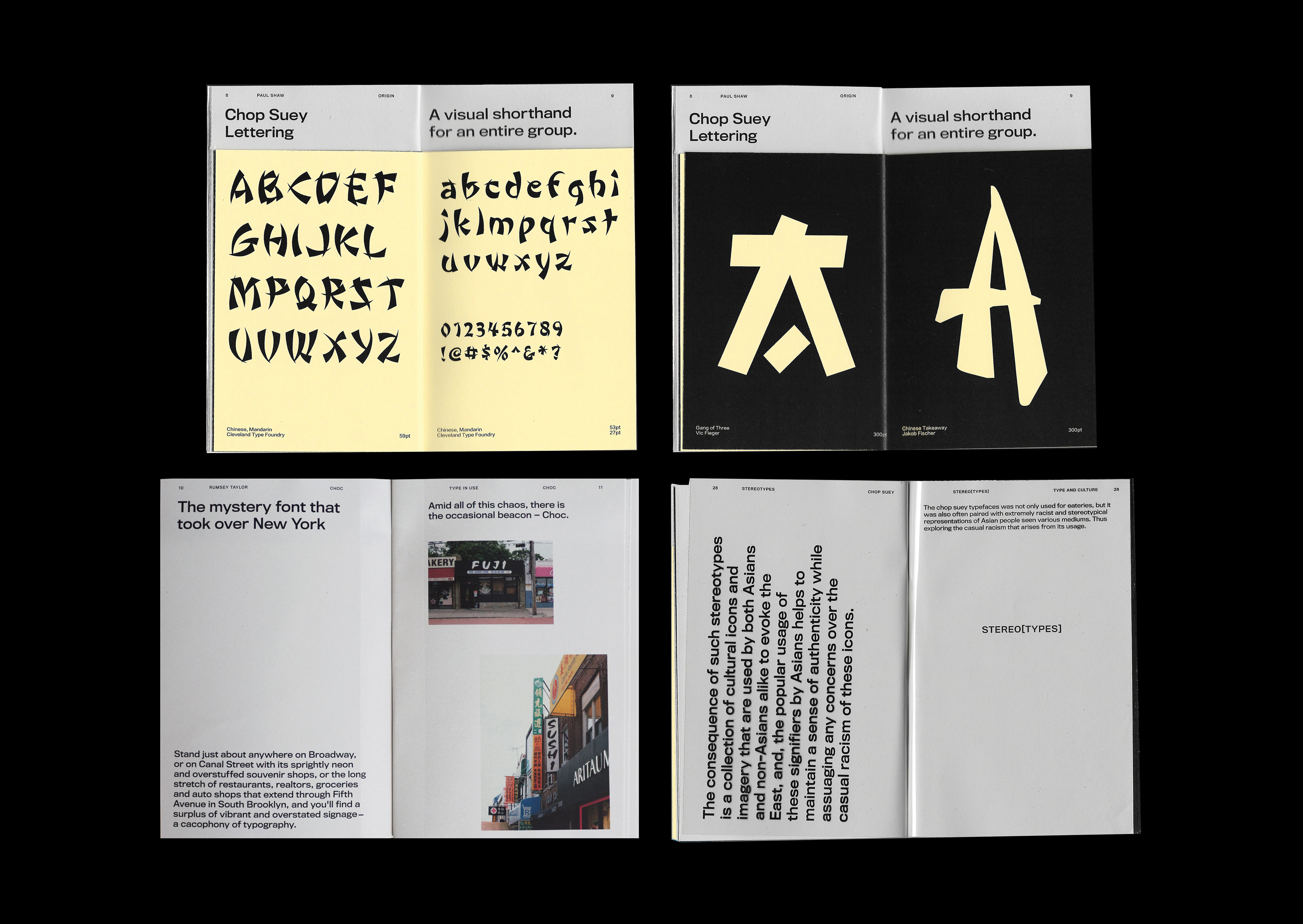
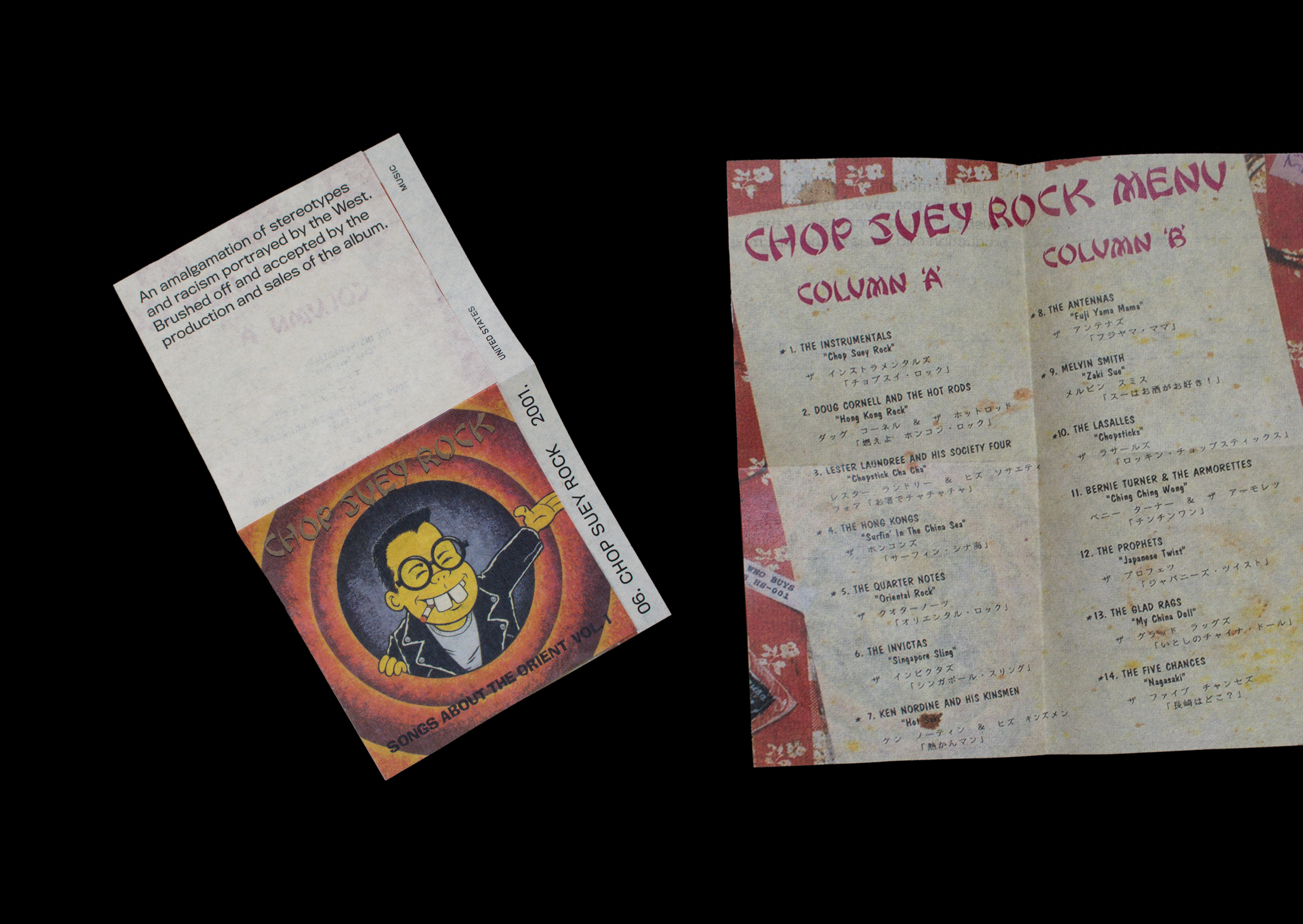
The contents in ‘Chop Suey’ show my research of the typeface and its origin, history and use. Exploring the idea that there are many different paths taken by a typeface from its creation, to its status as a visual shorthand for an entire group.
The case studies use critical thinking to situate the typefaces and show products that hold cultural commodity, to sell the culture and to define its authenticity through the typeface they’ve used. This discusses the broader issues about the cross-communication and understanding.
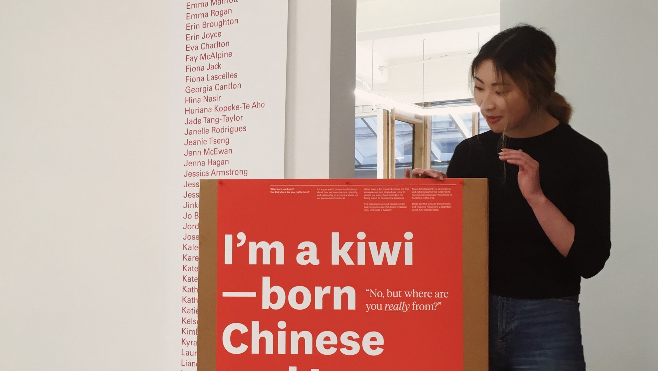
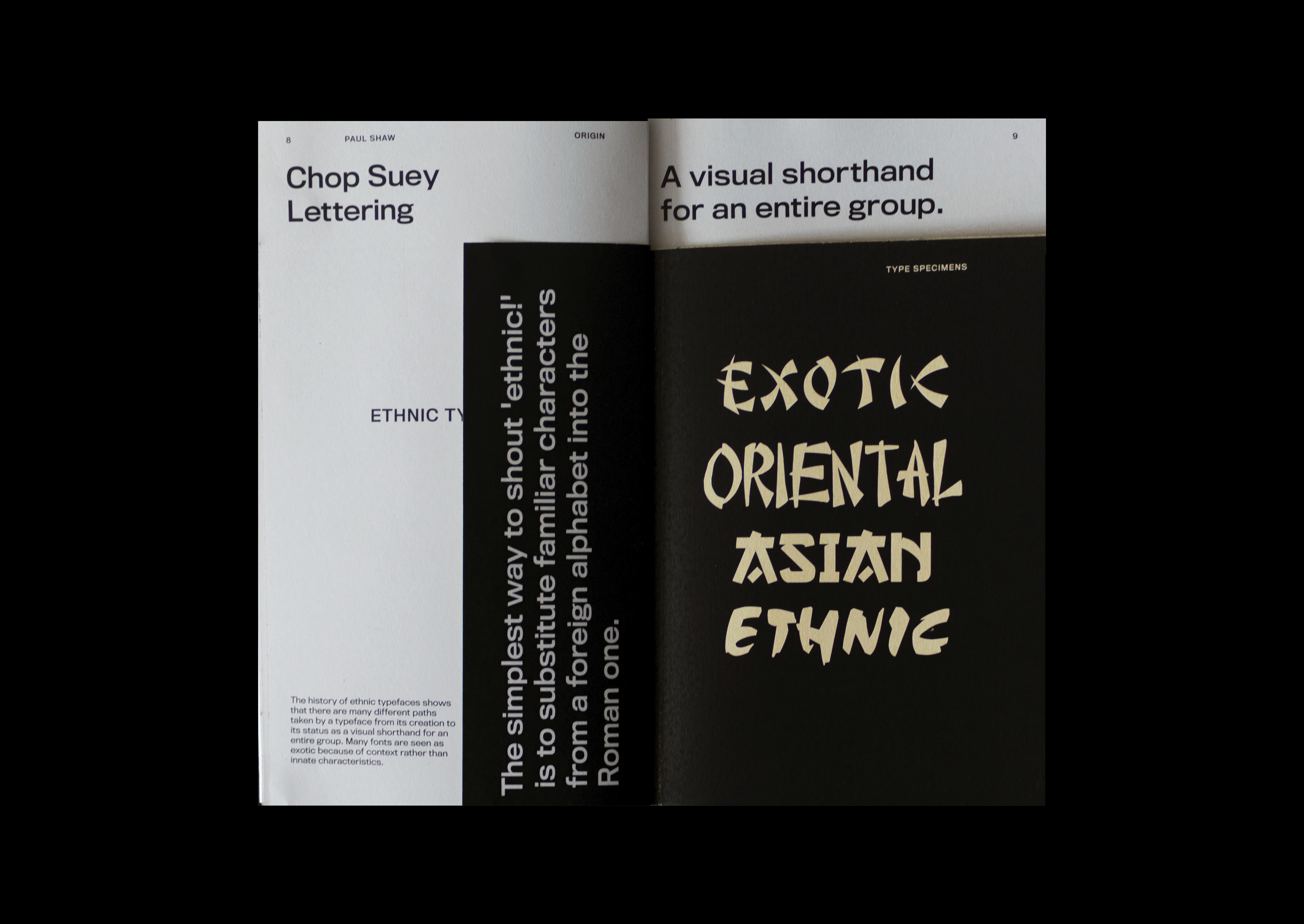
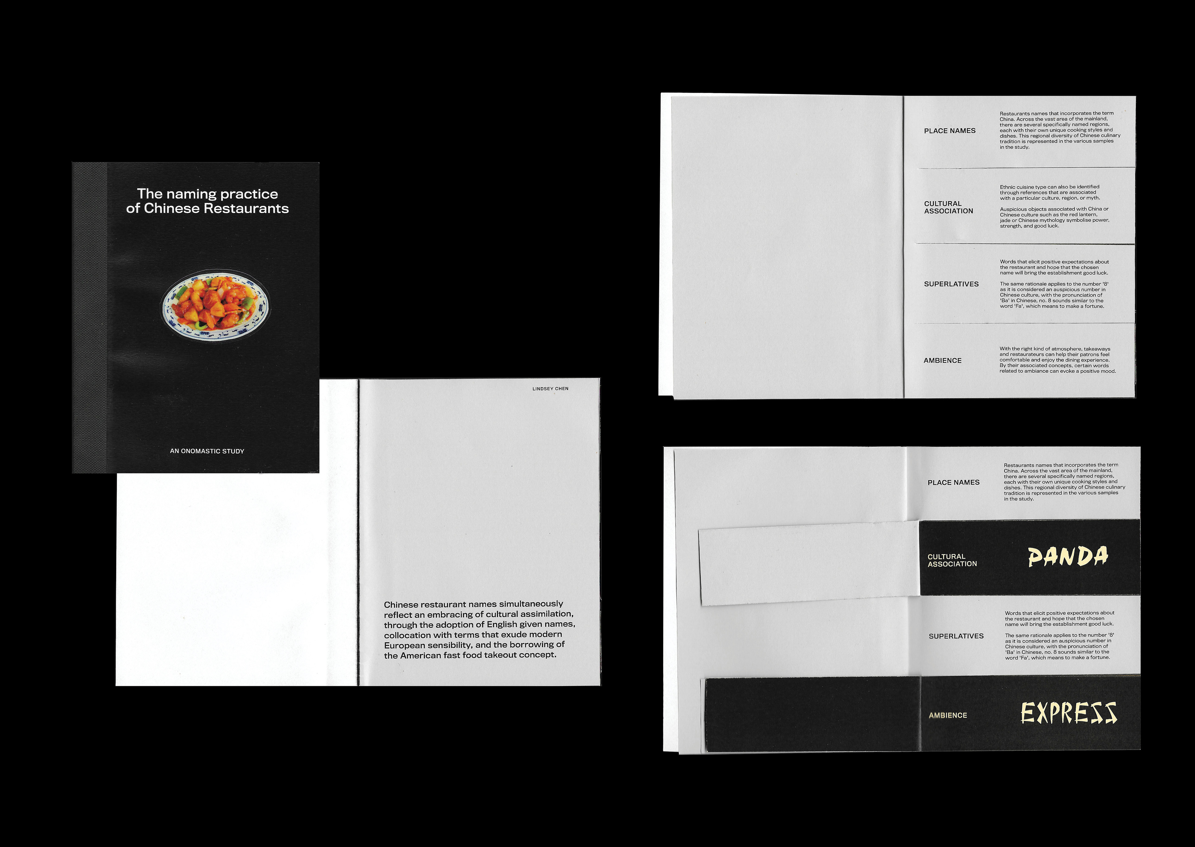
Since growing up I have noticed the use of ‘ethnic lettering’ in the signage of Chinese restaurants and questioned the authenticity and reason as to why it’s been used as a visual shortcut for an entire culture.
As the same lettering is applied in a different context - to mock, stereotype and mimic Asian culture. So then, why do Chinese restaurants continue to adopt these lettering types to prove the authenticity of their restaurant?
█